Click below for more examples of deck design. Password required.
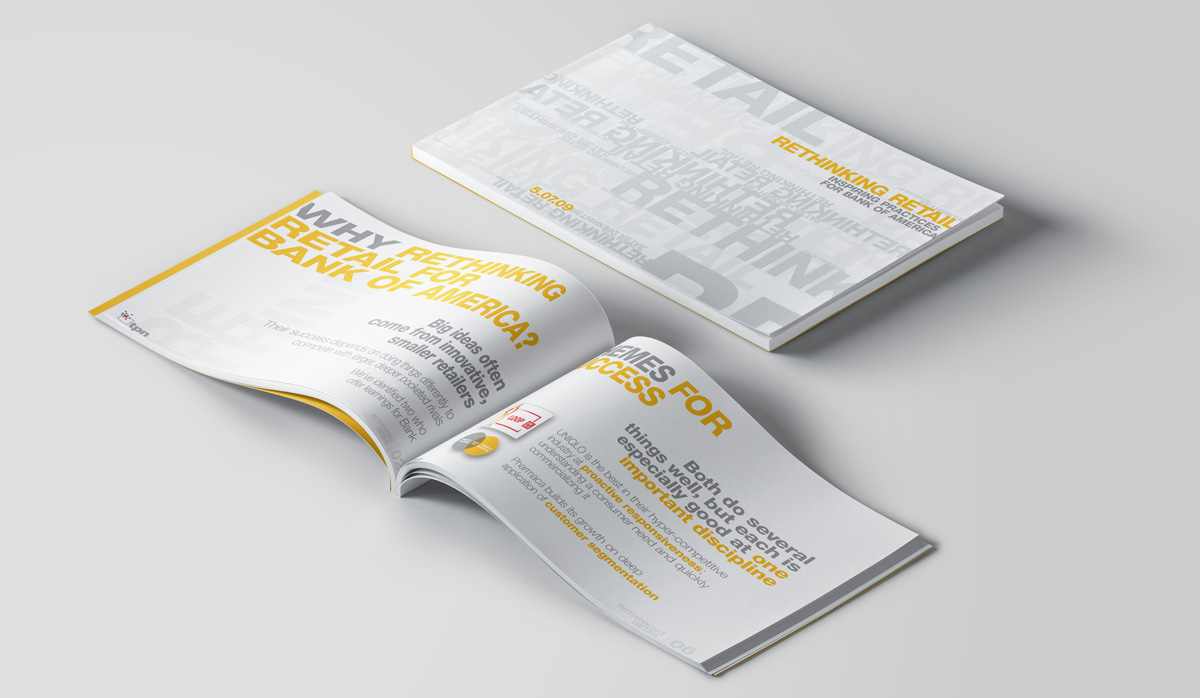
This document was presented at a summit / work session with top Bank of America clients and featured best in class retail case studies of Uniqlo and Pharmaca along with thought starters for each. The meeting turned out to be an epic failure. Want to know why? Give me a call!
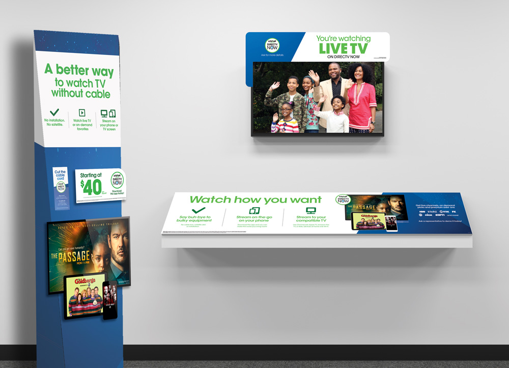
Following a landmark research study, we learned that our shopper was still unclear of the benefits of DTV NOW and the differences between it and DTV’s traditional satellite offering. With compelling copy and clean creative, we struck the perfect balance of impactful and informative.
Lead designer: Julie Smyth
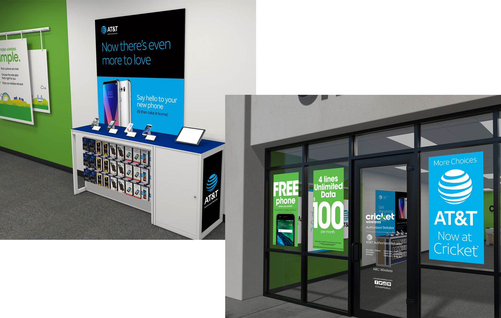
This test was run in select markets that had Cricket Wireless retail space, but no AT&T presence. The challenge was to retrofit existing displays as easily and inexpensively as possible, while staying true to both brands.
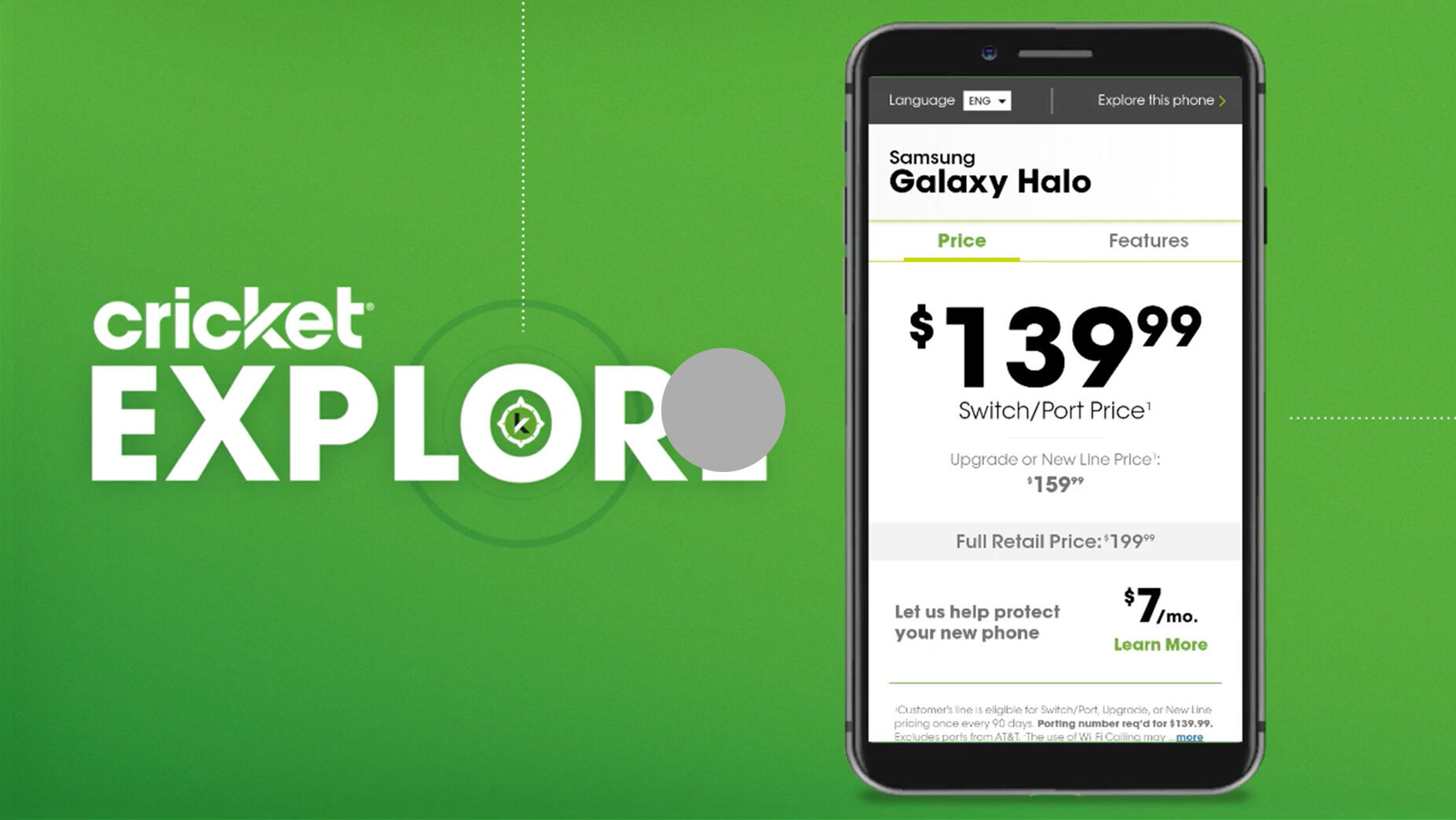
This ambitious pilot sought to replace paper price tags with an interactive experience complete with phone features, rate plan info, and add-ons.
UI: Darrow Alexander
UX: Sara Bafundo, Rianna Melendez
Copy: Alexandria Mariscal Zozokos
Acct: Layla Chen
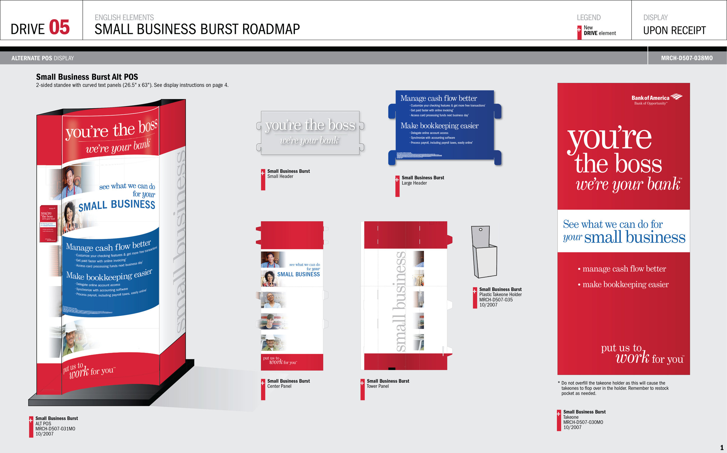
This display used curved panels of different opacity and sheen to catch the eye of the B2B target. The Roadmap document template was designed for banking center associates and was often versioned dozens of times for different regions or languages.
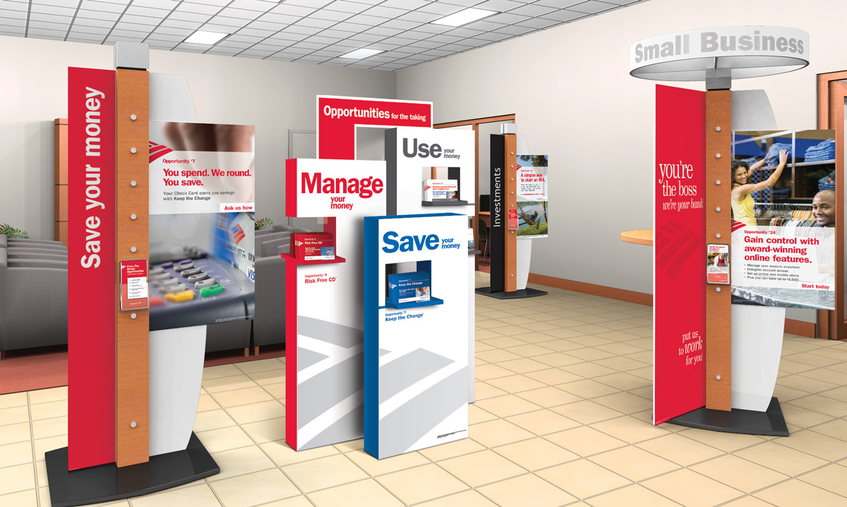
This semi-permanent display was a part of an ambitious pilot program to rethink the way customers “shop” retail banking services.
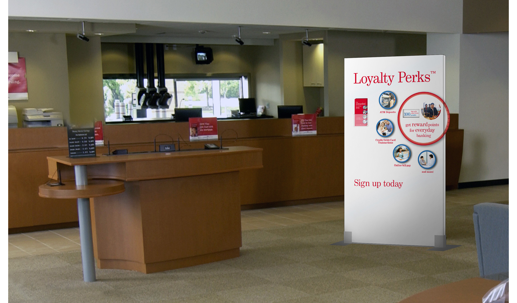
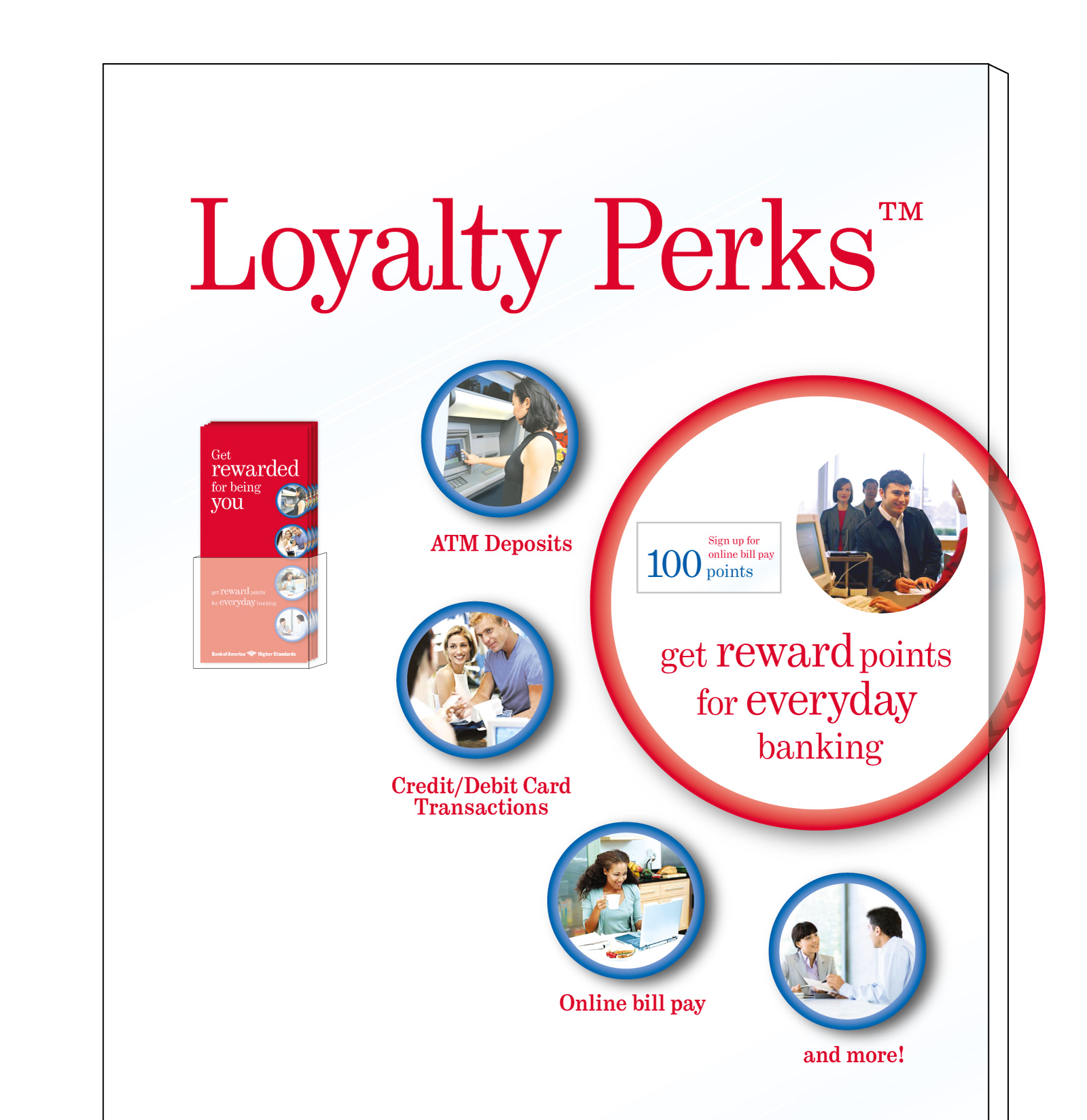
GOLD AWARD WINNER at the 2009 ARF David Ogilvy Awards.
This temporary display was meant to attract attention—a clean white slab in a sea of wood and red branding with the promise of being rewarded for loyalty.
The strong call to action plays on a human truth, get something for what you’re already doing. The display further engages the customer with a large interactive wheel showing the point values for eight different banking activities.
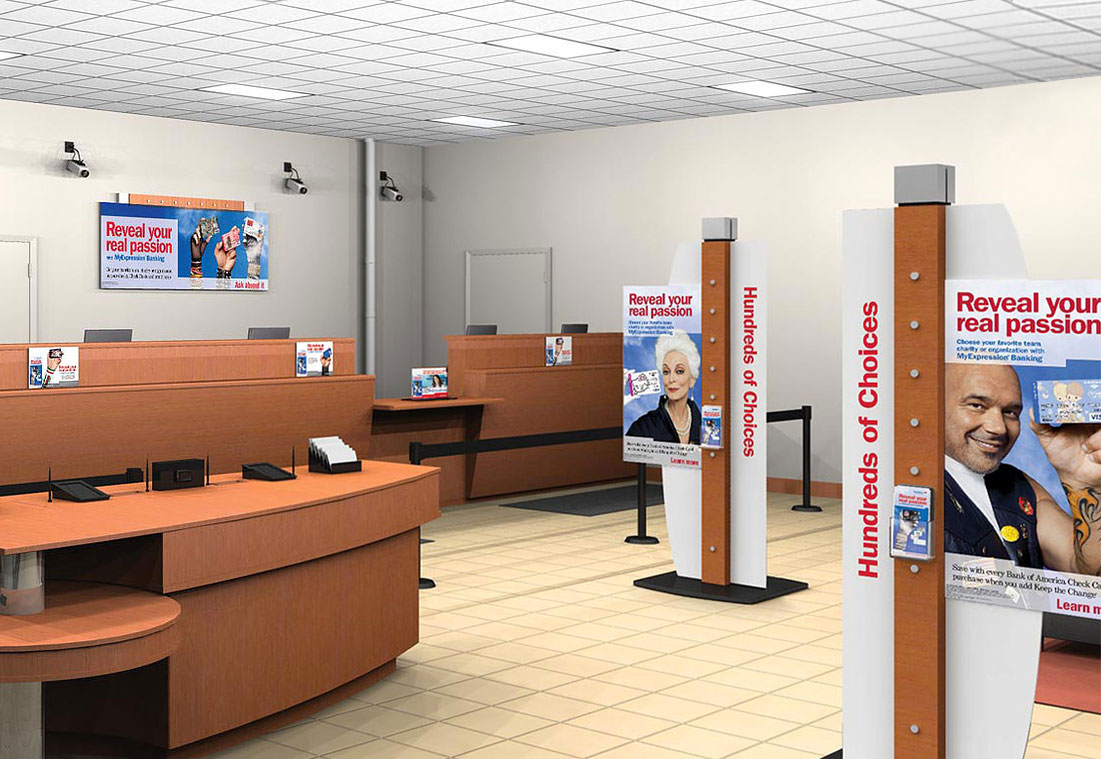
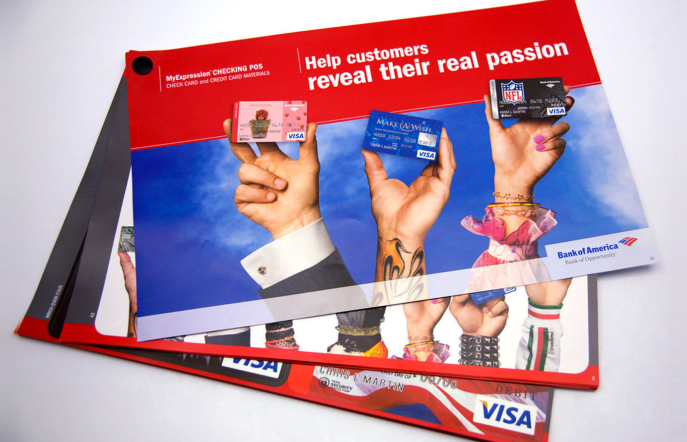
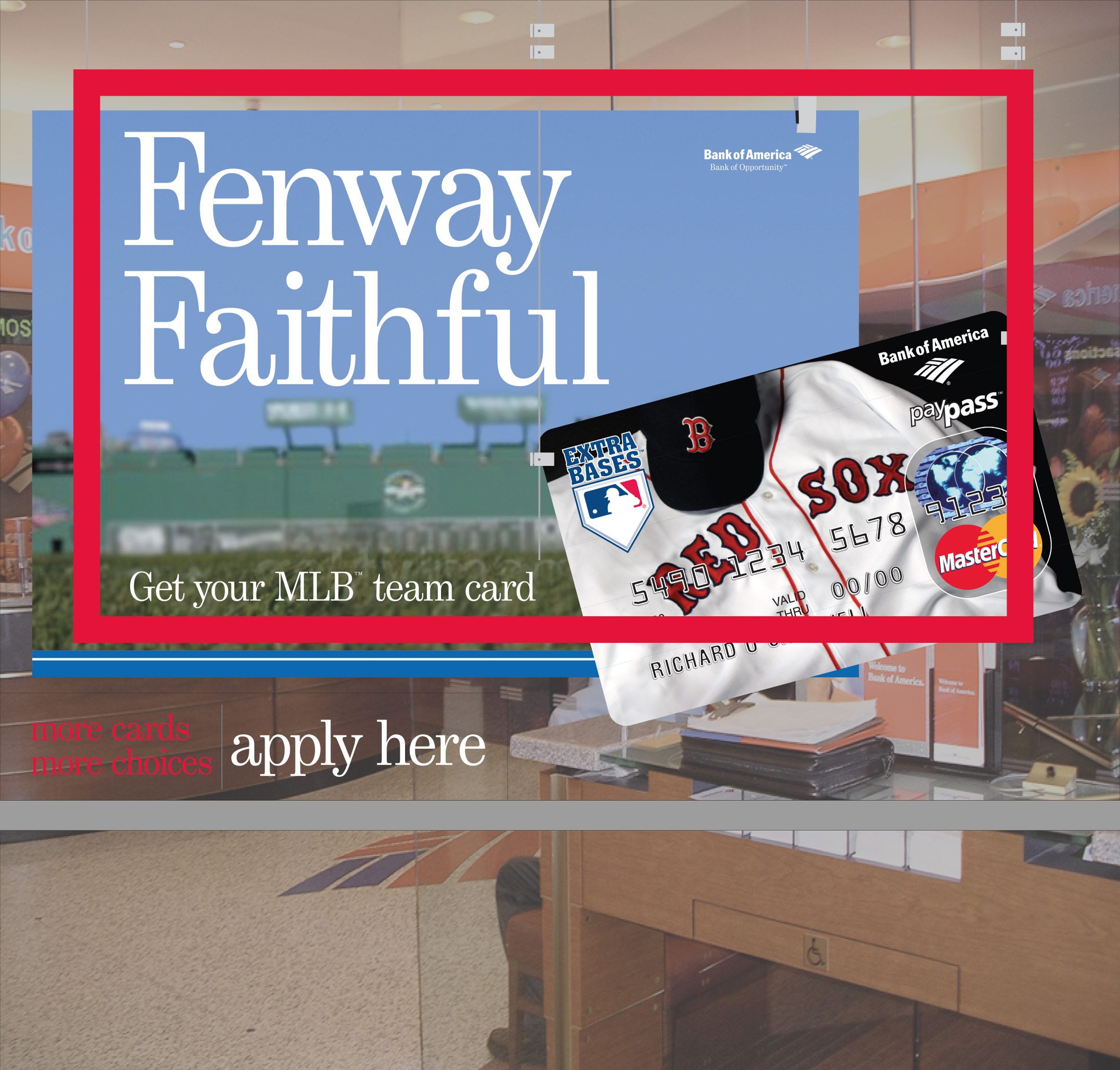
Working with a concept sold in by partner BBDO, we made the hyper-localization of over 5,000 banking centers not only possible, but affordable.
With over 130 licensed sports teams, universities, and organizations to choose from each banking center manager was given a region-specific decal book so the card shown on the signage could reflect their customers’ unique passions.
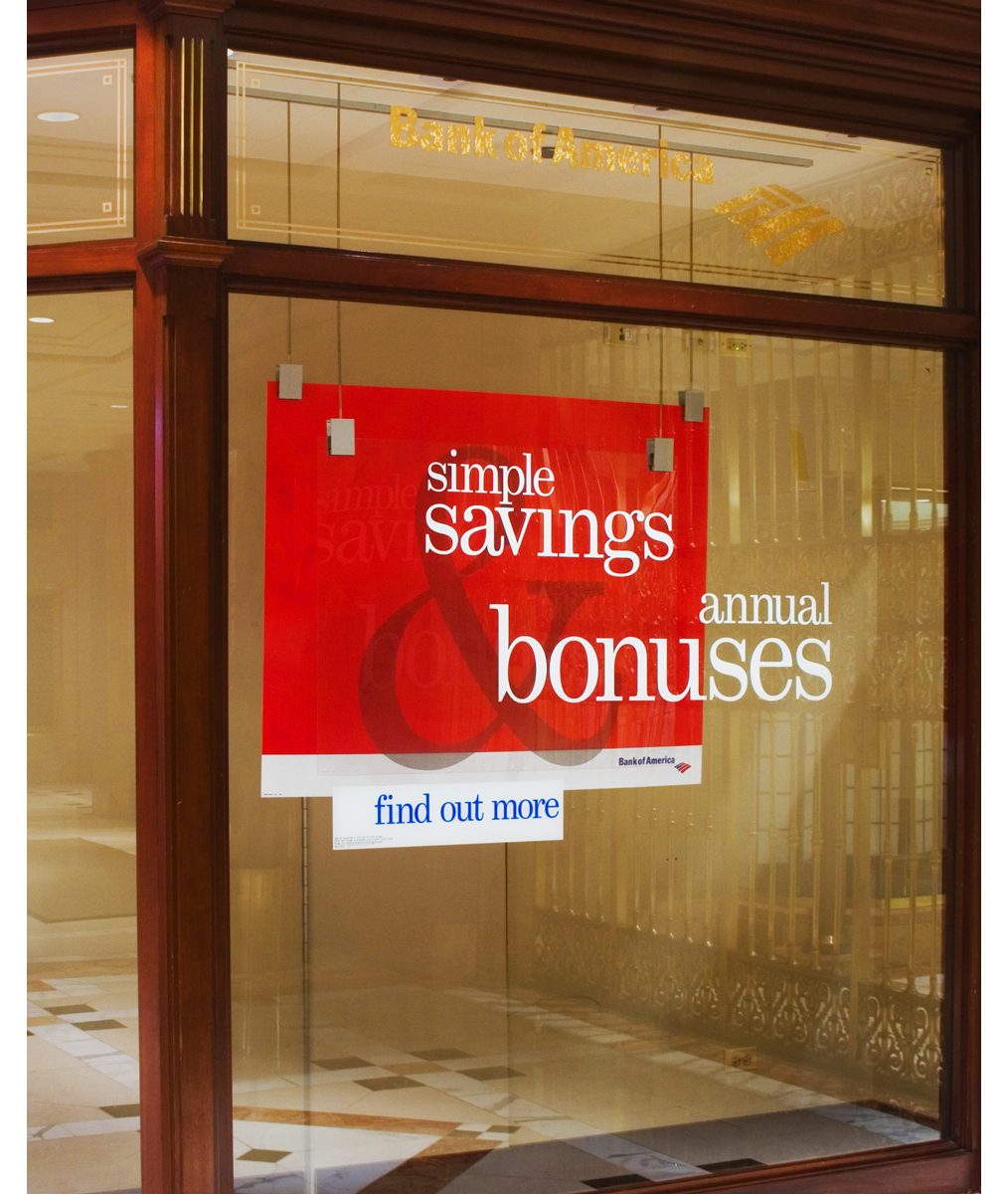
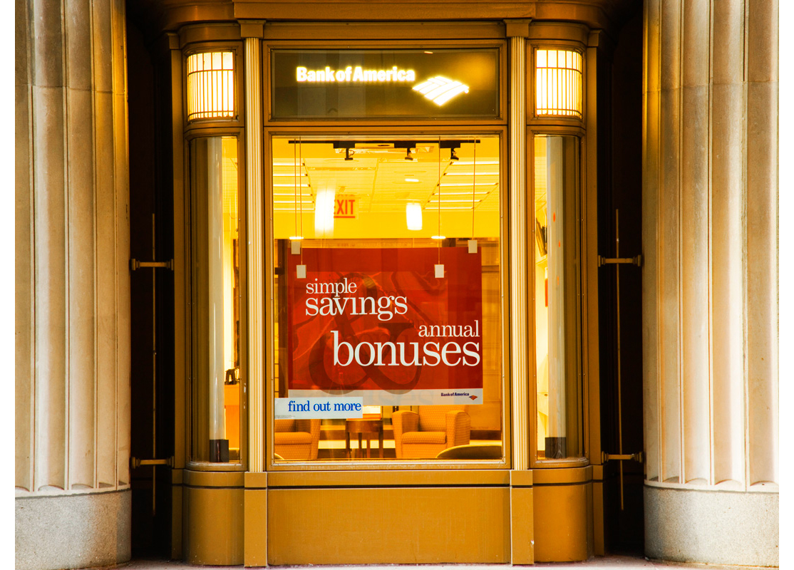
To illustrate the idea of our Bank of America customer getting a LOT more, this type-driven concept uses a supergraphic ampersand and bold color palette to attract attention and break out of the stodgy “bank look.”
The brief required that we focus on two extremely different products: Keep the Change (an incremental intro to savings) and Balance Rewards (a money market account paying you back for larger account balances). Our type-driven solution culled this down to focus on “savings” & “bonuses” on exterior elements, then optimized the message map to combine and separate them as appropriate throughout the banking center.
Multi-layered window treatment using the ALU system.
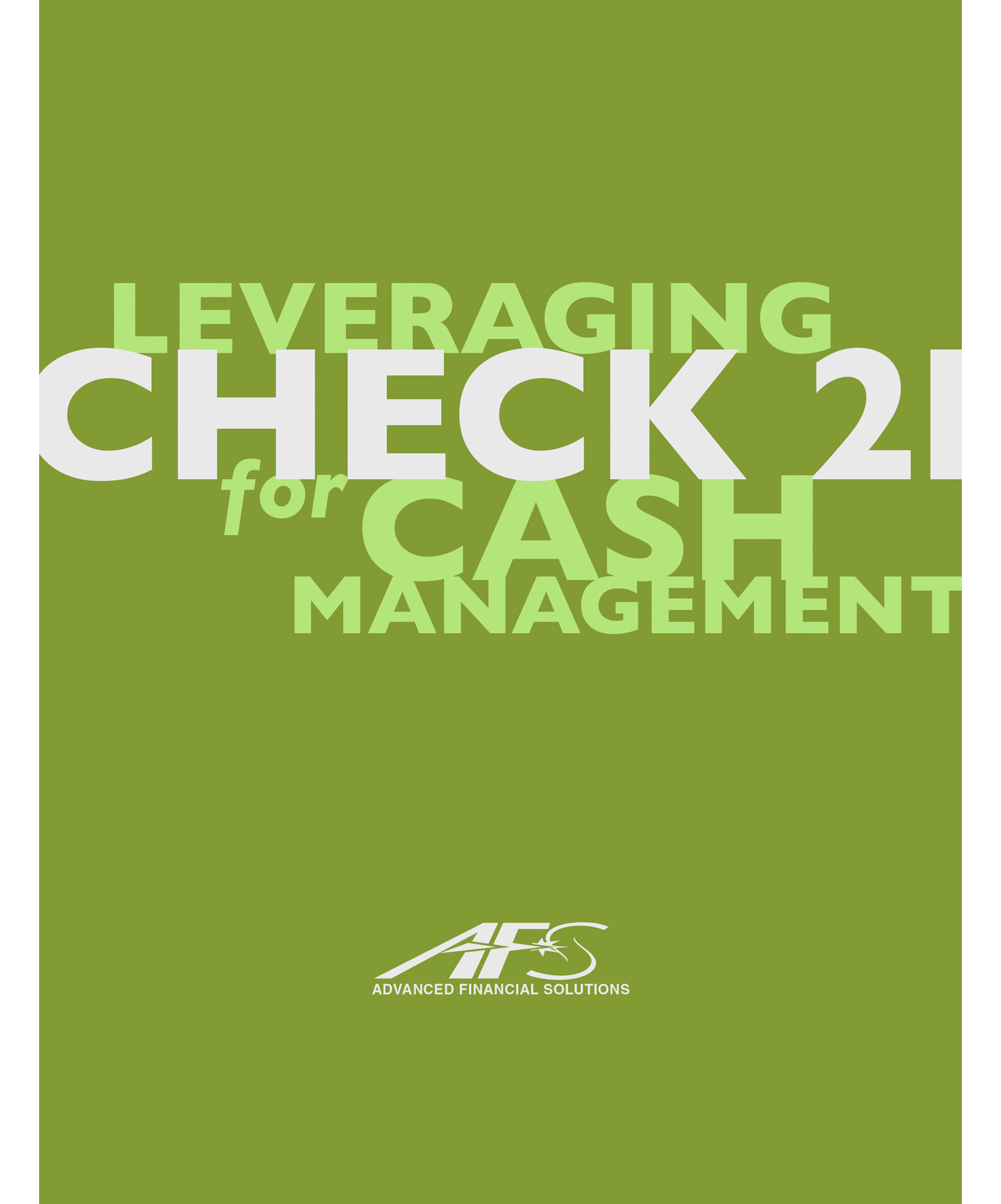
When the Check 21 Act was passed in 2003 it was big news for bankers. This campaign poster touted our expertise in digitizing checks (truncation) and helped position us as a leader in check capture software.
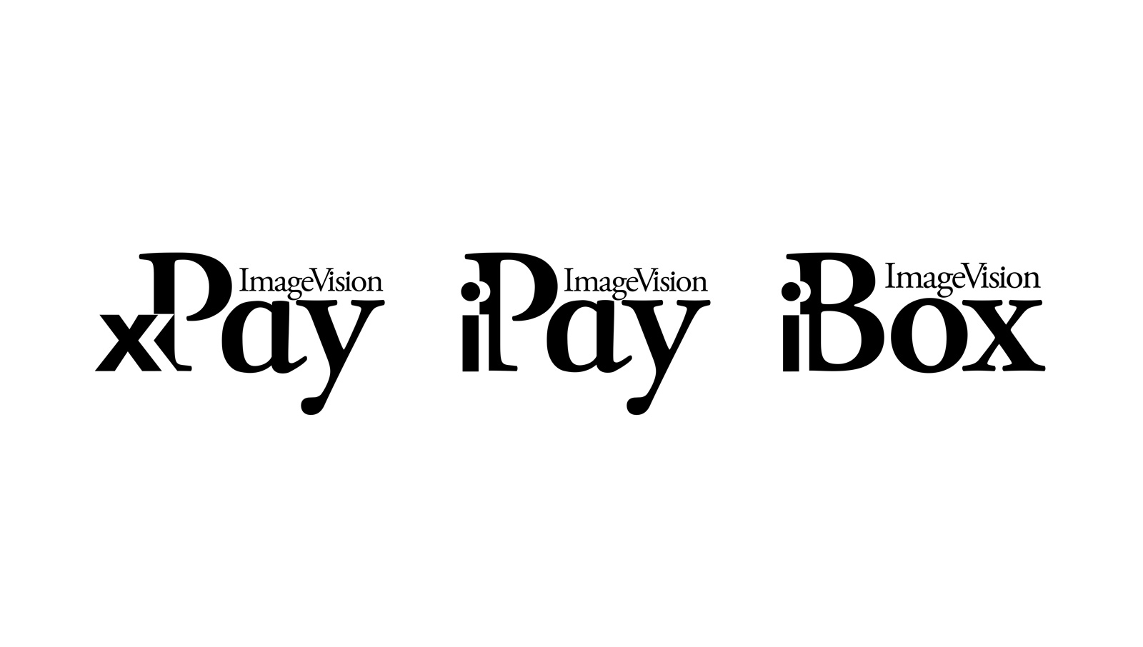
A series of marks to brand a la carte add ons to our signature software — ImageVision. Combines a traditional and trustworthy banking feel with the disruption our technology brought to the industry.
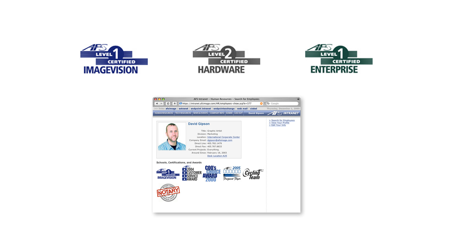
I was responsible for creating dozens of icons and lockups featured on employee intranet pages.
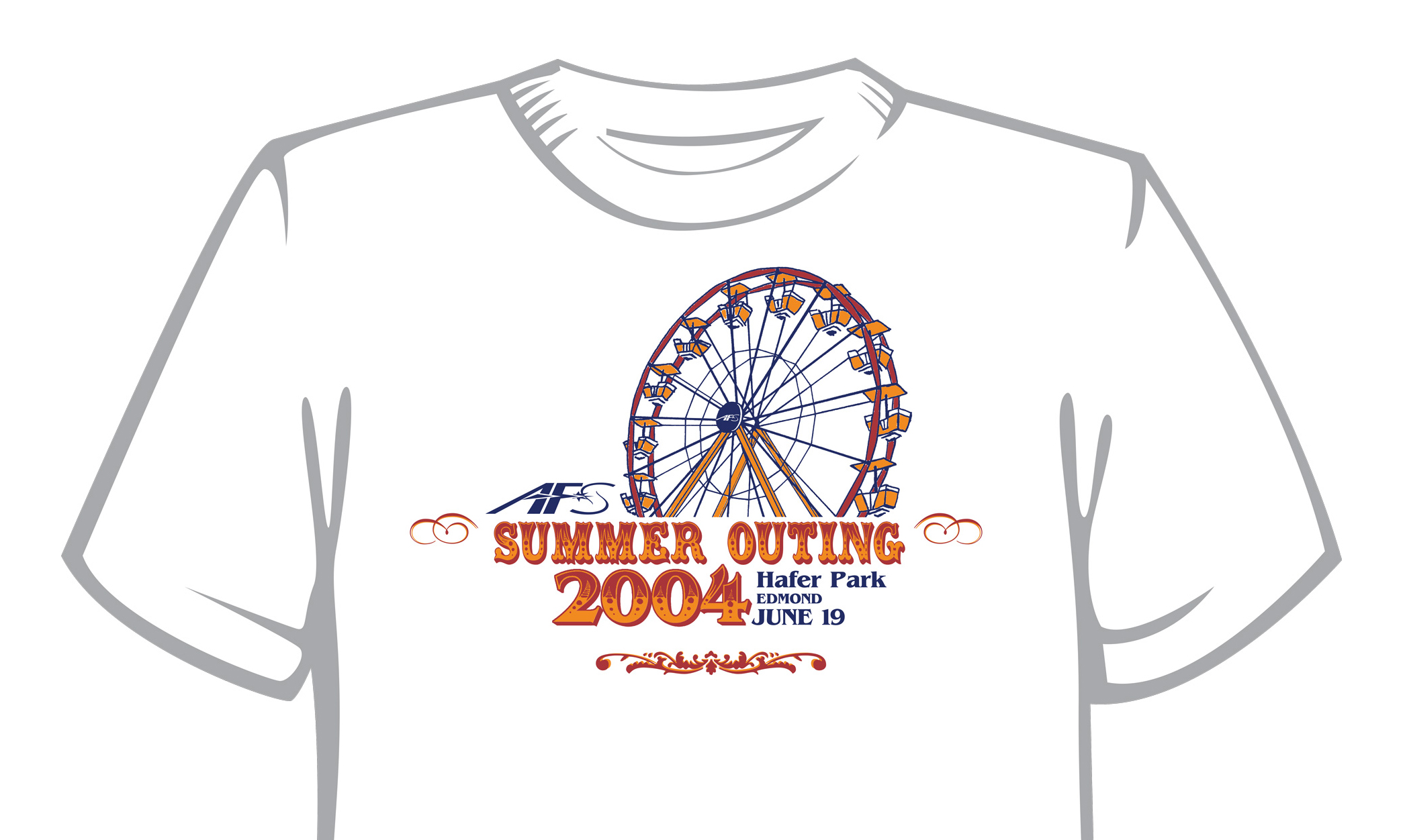
This family-friendly company outing was carnival themed. So, ya know, ferris wheel.
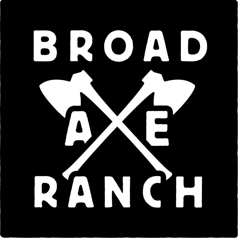
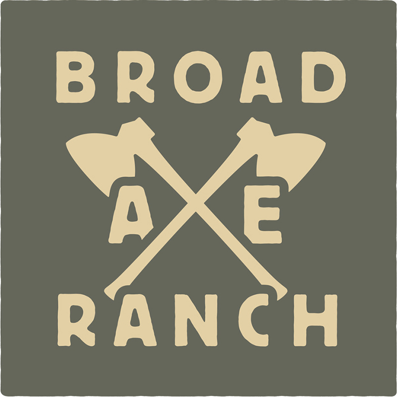
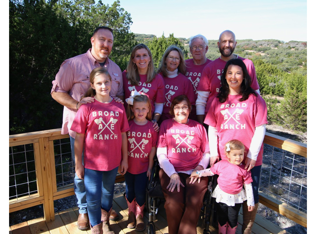
Identity done for my Grandmother's ranch in the Texas hill country.
Color combination as voted on by family members. It had to be gender neutral, but I wanted to explore combinations inspired by the surrounding landscape: brush grass, river rocks, caliche, etc.
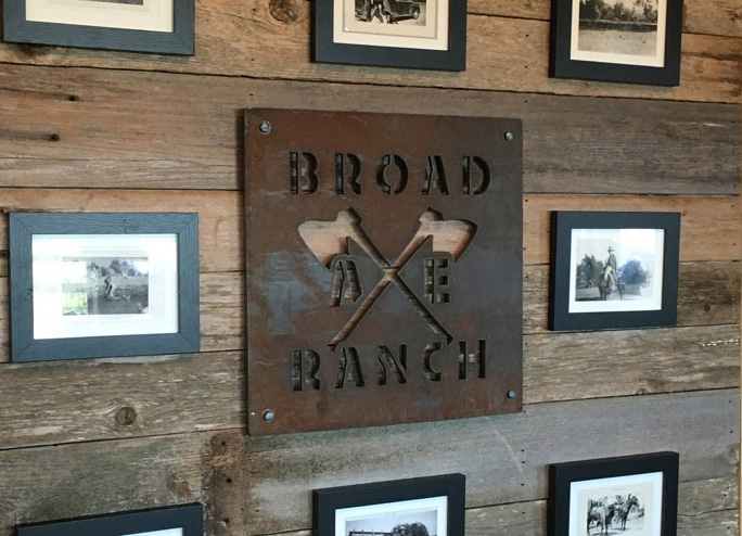
An accent wall in the cabin featuring a plasma cut and hand-distressed steel sign. I almost like the stencil version better than the original.
Our first time at the cabin, to celebrate my grandmother’s 90th birthday.
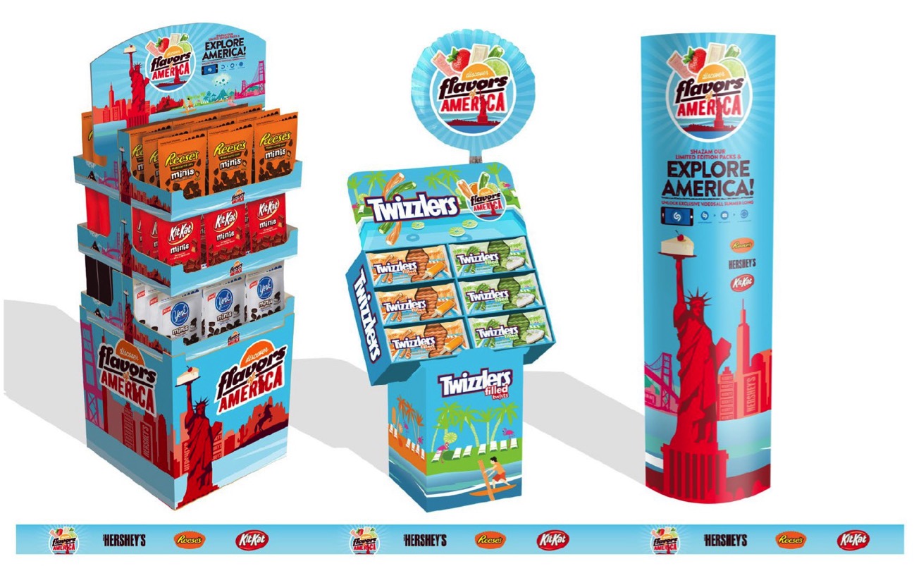
Hershey invested heavily in this summer promotion, creating limited edition flavors inspired by select states: Texas BBQ, Florida Key Lime, Hawaii Coconut, etc. Our team also used influencers to visit each state providing video content used across the digital landscape.
Lead designer: Ben Jackson
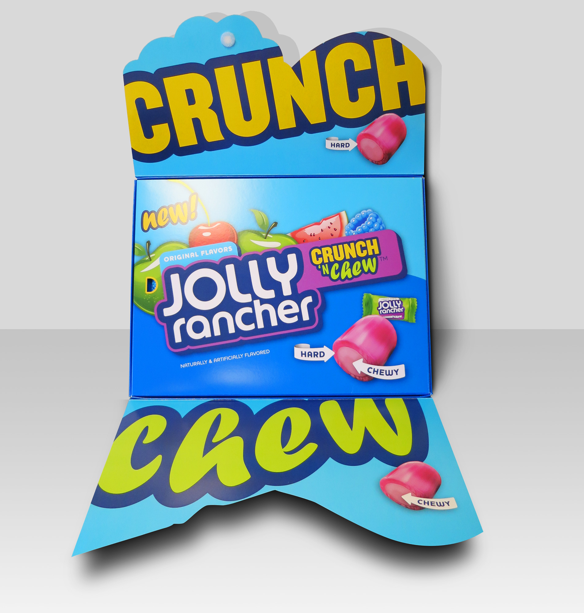
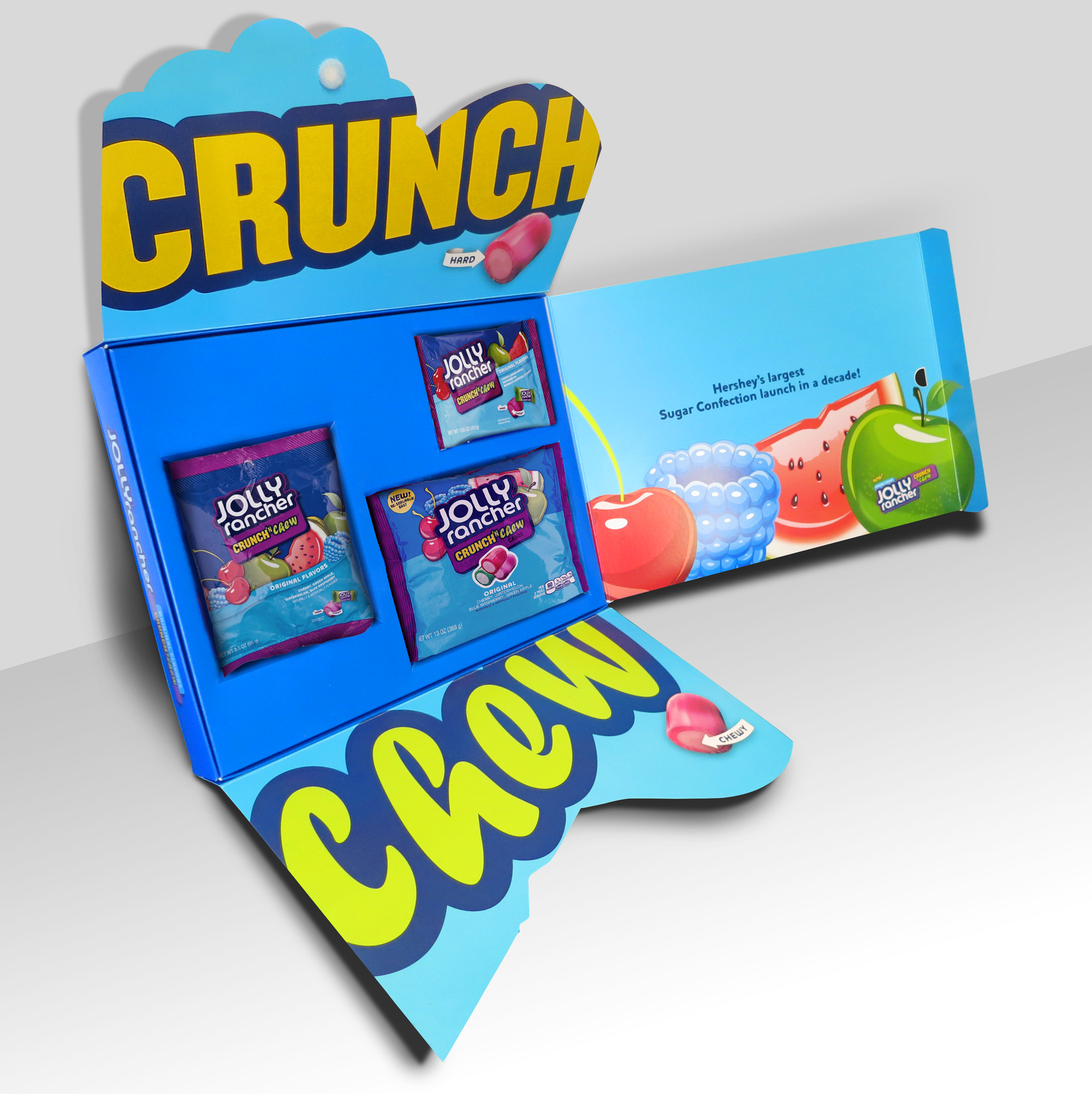
This innovative kit used illustrated super graphic fruits as the lid flaps along with bold typography and bright brand colors to grab the user by the eyeballs and not let go.
Lead designer: Ben Jackson
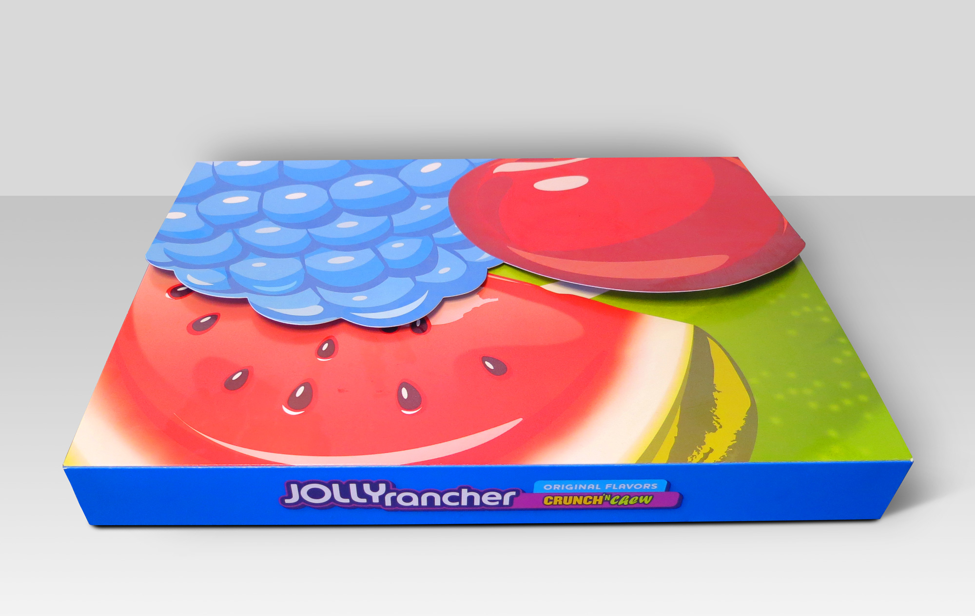
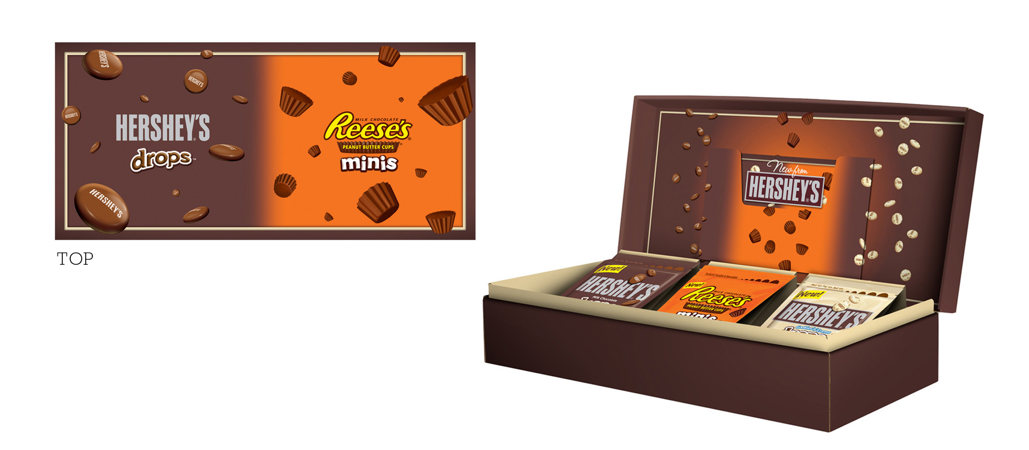
To excite grocery chain key decision makers about The Hershey Company’s biggest launch in decades, we designed a premium (yet cost effective) display box using bite-sized candy imagery (with spot gloss varnish) to reinforce the new candy line with infinite “Poppability”.
In order to increase sell in, the sales team would often pitch grocery stores “themed store takeovers” outside of the major holidays. These had to be candy brand agnostic, yet visually enticing enough to excite the store and the shopper.
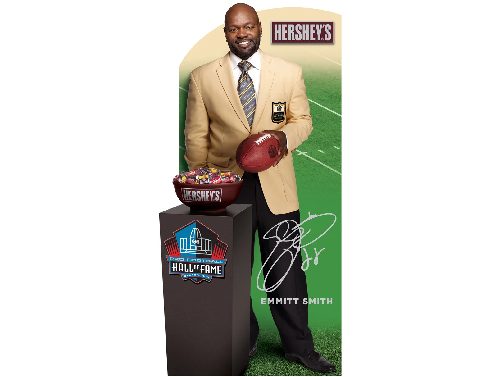
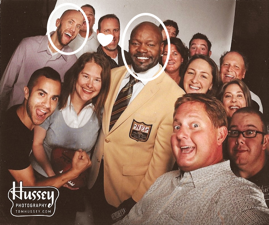
With Mars having the NFL sponsorship, Hershey’s was seeking relevance during pro football season. Enter the Hershey’s Miniatures partnership with the Pro Football Hall of Fame and new inductee Emmitt Smith. With hall-of-famers like Hershey’s, Krackel, and Goodbar on the table, you know your “Big Game” party will be legendary. Sports.
I wouldn’t say that I “met” Emmitt Smith. But we are best friends.
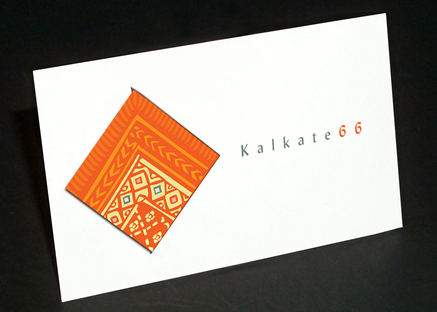
Folding business card - closed view
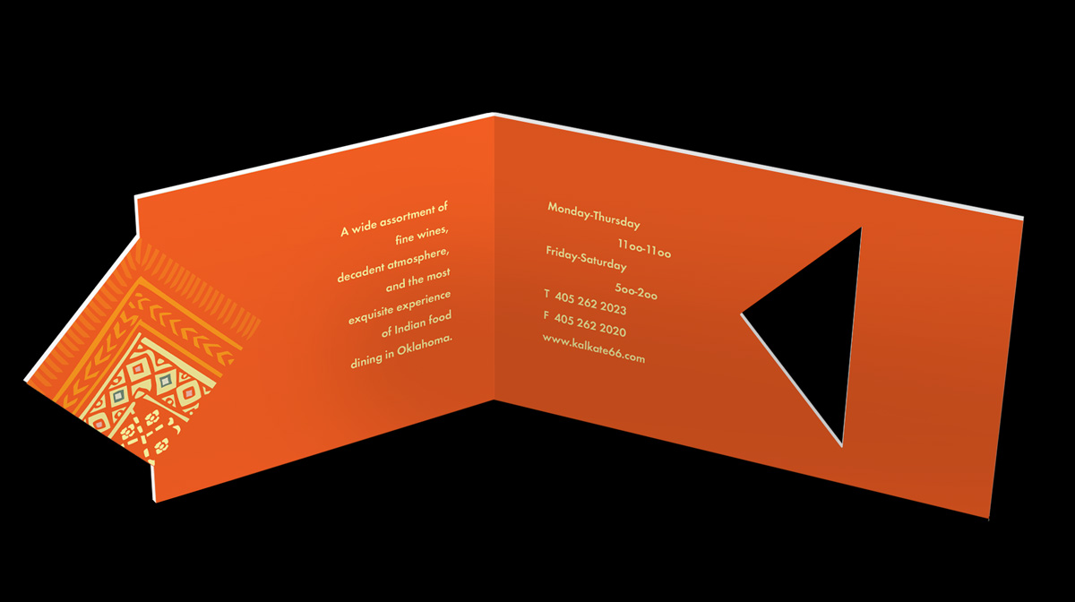
Folding business card - opened view
Click below for more examples of deck design. Password required.
